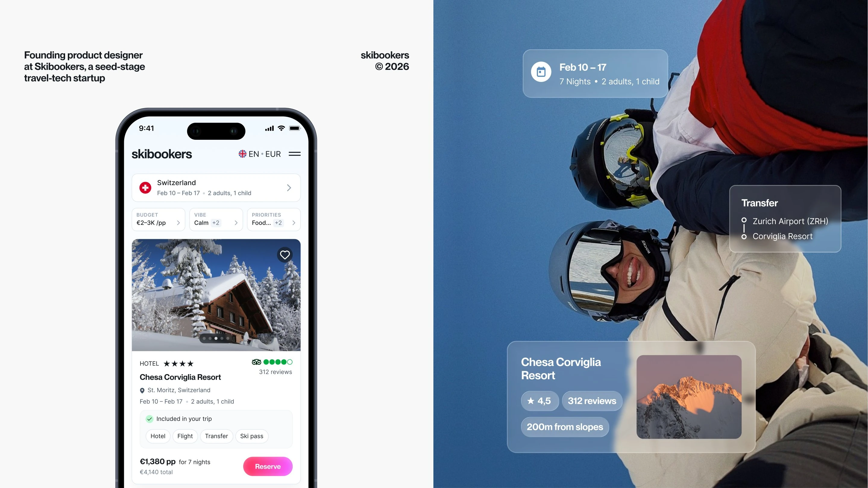
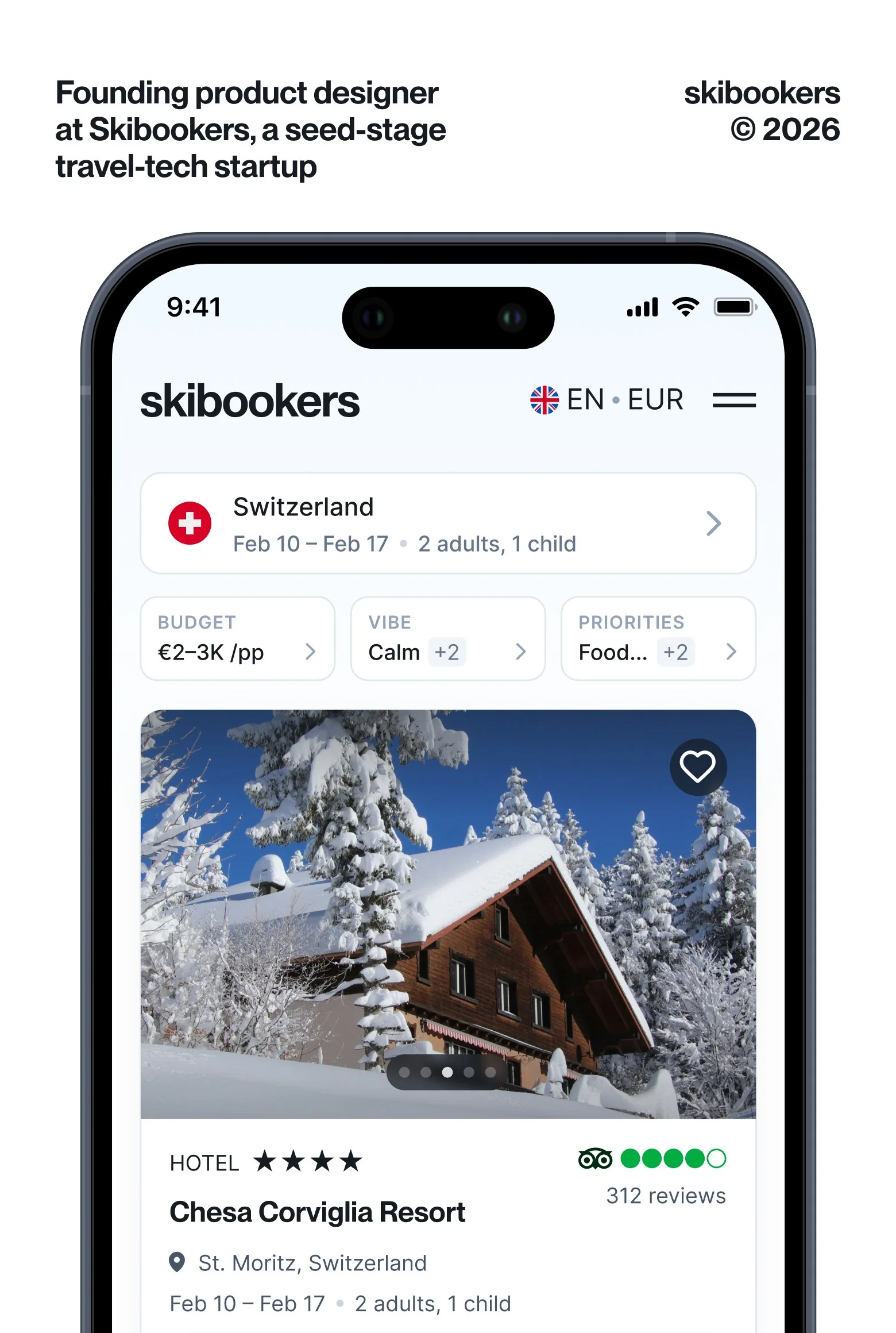

Skibookers is an AI-powered platform for planning and booking ski trips end-to-end
A seed-stage travel-tech startup competing with the classic OTA model (Booking or Expedia). The business bet was on a smart recommendation system powered by the parent company's data about ski travellers.
This case is about how the core product bet broke under real users, and how I reframed the product without giving up its positioning.
Role
Founding Senior Product Designer
Timeline:
July 2025 → April 2026
Deliverables
Core user flow from 0 to launch, design system, multi-step quiz with gamification, landing page, brand identity. Mobile & desktop
Team
CEO, CTO, frontend and backend engineers, PM (last 3 months only)
Contents
1.1 Business context
The CEO's earlier research suggested users would spend up to 10 minutes on onboarding if the perceived value was high enough*.
Parent company's data: 1.6M+ customers, 584 ski resorts. Operational data could power an AI-native recommendation layer.
The OTA model is saturating. AI-first travel players are emerging (Mindtrip, $22M Series A), and big players are adapting (Expedia in ChatGPT, TripAdvisor AI Planner)
*We validated this with our own user testing (see Appendix)
1.2 Team setup and timelines

+3
Product team
Scope to build
Quiz
Offer & Booking Flow
Brand
Design-system

The bet was that the recommendation engine could be confident enough to skip comparison: one ideal trip, one CTA, one click.

2.1 An internal testing (soft-launch)
The target audience: the holding company in Slack, around 200 team members
Launched UX testing on 13 people from Europe, not related to Skibookers and holding*
Technical audit with the outsource consultant
*See the quotes in Appendix
Internal testing
Full UX research findings
Researcher: Ksenia Gorbatova, n=13, December 2025
The December launch was cancelled.
The new design.
Skibookers is on live
CTO
New
Product Manager
New
The new launch date
3.1 First attempt: incremental updates

I made incremental improvements to the marketplace. Added editable pills for location and dates, and horizontal scroll for offers.
Goal: test if smaller changes could move conversion before committing to a full rebuild.
6.25%
3.2 The full redesign


3.3 What changed compared to v1
3.4 Outcomes
After the full redesign, conversion from offer page to user details increased 3×
6.25%
Before redesign
18.5%
After redesign
Conclusion & Reflection
4.1 Key numbers
2
Launches in 10 months and 1 major cross-platform redesign.
89%
Of quiz starters reached the offer page. Format validated by research.
×3
Conversion lift from offer page to user details.
6.25% → 18.5%.
0 sales
Business factors, not design: pricing, supply, audience.
In April, Skibookers pivoted. In May, the project was paused.
4.2 What I would do differently
Validate willingness to pay before optimizing the funnel. We focused UX research on usability: flow clarity, comparison preference, conversion friction.
Delegate system work to keep product focus. My attention split between system-level decisions, product decisions and brand work. The design system could have gone to an external designer earlier.


Time spent


Product overview

Funnel (18 Feb – 3 Mar)

Device categories


UX Research Insights
Recommendations missed user inputs
«Okay, well that's probably, definitely a negative. Haven't been able to find anything for my preferences, which isn't ideal.»
«There are no hotels available for my current preferences.»
«Oh, this one is twice as expensive.» (about an offer that came back well above the stated budget)
«It also shows me something about the airport here, which is not relevant for me.» (about a flight pushed onto a user who lives near the resort and drives there)
«Mainly look for location and the amount of slopes, which it didn't have.»
Users wanted comparison, not commitment
«I would like others to choose from because now I know what I can get for a bit more money and what I will get for less money.»
«[I suggest] much more options to choose from… comparable… so I can make a more informed decision.»
«I think one best match coupled with other options.»
«I don't like the fact that I have to click the button for next offers. You could have made this sort of three or four… on each page.»
Looks good, doesn't deliver
«The flow is good, but there are some serious problems… check out only then told that there was no [hotel] available… thought waste of my time.»
«It is a bit naughty though, because it says that one price, everything is included, but then you've got your lift passes, insurance and snow guarantee at the bottom. So it's kind of a little bit misleading.» (about the "all included" promise that falls apart on the results)
«I would still need to check out their website and some more, do some more research.» (despite the polished presentation, the product doesn't close the decision)
«Modern design, much too much content» and «There's a quiz, but then you've got all that in your face and I don't understand it. It's really confusing.»
Researcher: Ksenia Gorbatova, December 2025
Contact
Pavel Schneider © 2026